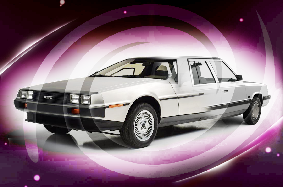
Form Vs. Function? Both!
Better creative, by design.
By Kory Davidson, Associate Creative Director
I grew up a car guy. Well, at least I like to think of myself as one. Mostly because my Dad IS an old car guy; pin-striper, custom car painter, body shop manager. His whole life has been about cars – from racecars to street rods. I grew up thinking I had to be a “car guy.” As a teenager, I worked at a body shop with my Dad and Uncles, where I learned how to sling paint, throw bondo, and do all the things that it takes to make a car “look” good. I was taught by guys who spent their careers in the industry and who were particularly drawn to the aesthetics of a car. To them, the “look” was everything.
My first car was a two-toned ’55 Chevy - turquoise and white. It was cool and I felt cool behind the wheel. When I drove around town people knew it was me. They also recognized me when they’d see me broke down in some parking lot or by the side of the road. You see, I only knew how to work on the exterior of a car; my understanding of what goes on under the hood was quite limited. I’ve never been a gear head. I know how to add gas, check the oil and change a tire but not much else. I knew how to make a car look its best in order to get noticed and have an impact, visually. In many ways, I am sure my time spent with my Dad and Uncles in that body shop shaped my outlook as a creative artist.
As an Associate Creative Director at Strum, my job is helping clients like you create and develop brands. We work with clients to collect, understand and harness the data that is gathered regarding their customers’ needs, tendencies, habits, etc. Creating brands that are relevant to their audience in order to better meet customer needs. Using “science” to effectively target and provide more meaningful solutions to meet their members’ financial goals. But opposite the volumes of data that help inform marketing strategy, we still need to create something that helps to differentiate, get your brand noticed and ultimately, looks cool. Along with my team, that’s where I come in.
Over time I’ve learned that Form and Function are equally important. For me, nothing emphasizes the importance of striking the balance between these two creative ingredients more than the auto industry. From the early ‘80s (again, my creative formative years), I am reminded of two extremes: the Aries K-car and the DeLorean. I’m sure many of you remember these two marvels of ingenuity?
Hard-working function.
The Aries K-car was very practical and functional, got the job done affordably, had the prerequisite four doors and wheels and when you turned the key it just worked. It was pure assembly-line efficiency; everything works the same, no frills, no surprises, serves the purpose. All function with no frills. The problem it faced was that there wasn’t any differentiation – the K-cars all looked the same, because they were: Dodge, Plymouth, Chrysler, the automotive equivalent of K-clones. Initially, they sold well and Chrysler made a bunch of them but production fell off in a fairly short period of time. Over the years they’ve been reduced in memory as an ‘80’s trivia punch line.
Working too hard at form.
Now let’s compare another ’80’s icon, the DeLorean. WOW! The complete opposite of the K-cars’ understated form. All stainless steel body, rear engine, gull-wing doors. A truly futuristic vehicle that would one day come Back to the Future, but I digress. It looked super advanced and was posed to jet the auto industry forward. Demand was at first very promising, but the factory was only able to produce half the number of vehicles per week from what they had originally planned. Adding to consumer frustration was a disappointing lack of power, especially given its advanced look and price. It too did not last and was in production for less than two years. Clearly, “form” alone could not make up for its lack of “function”.
Full disclosure: I never owned either vehicle and as I reflect on how each fell short I don’t think I missed much. One was all form and the other mostly function. Both went too far to the ends of the pendulum without enough blending of the best attributes in the middle. I think it’s very similar to how the building of a brand and its marketing works: having cool, captivating visuals that aren’t based in strategy is limiting, YET having just straightforward “functional” branding is limiting as well. Marketing has to look good to catch the buyer’s eye, and when it does the product or service damn well better work as promised.
Based on what we learn through Strum’s discovery process, we can help a brand to better define and further understand their target audience. We then build a strategy that will allow our clients to be more focused on their message, content, the products offered, etc. It’s all about deciding what the function of the brand strategy needs to be. Then the creative team dives in, where we help clients reach their customers in ways that resonate, creating a greater opportunity to engage in a deeper and more impactful relationship. In effect, these communications serve as the form to best express the strategy’s function. By creating a strong and lasting visual presence, we help our clients to make a deep connection and provide the customer or member with a sense of truly being recognized and valued. To make them feel important and connected to something that will help them stand out in a world of sameness and to feel just a little bit more unique and cool themselves. Because they are.

