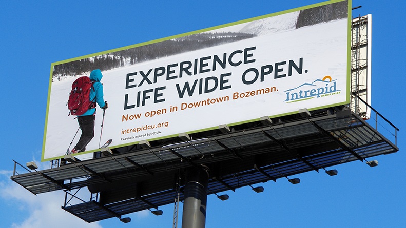
Intrepid Credit Union embraces life wide open
Big growth plans demanded a big new voice.
Inspired by Montana itself, we created a brand about “Life Wide Open.”
Solution:
Just like the plucky early pioneers that helped settle sprawling Montana, Intrepid was chosen as a name befitting this community credit union’s indomitable spirit. Like a wagon stocked with provisions for the westward trek, Intrepid’s new name, logo and engaging brand look and feel are sure to be a hit with the youthful target audience that will help fuel future growth. Wagons ho!
Challenge:
Like the large and geographically diverse state of Montana itself, the previous brand for Helena Community Credit Union seemed to be going in all directions at once. Our challenge was to help reign things a bit, in order to set a proper foundation for actionable regional growth from Montana outward.
Life Wide Open
It’s a way of life for Intrepid Credit Union. This brand really hangs their hat on the lifestyle that is Montana. If you don’t know the names of the mountains in the region, you’re likely new. Photography is regional and shows people who’re in the thick of it, living life in the wide open of Montana. We have a couple of graphic elements. One, is a brush stroke that represents the hands-on approach Intrepid has with their members, this is used to house headlines, section off information or accent copy in some way. The other graphic is the mountains and setting sun from their logo. This is often used in similar ways to the brush stroke, but saved for “hero” elements such as the headlines on the front of a piece or to accent photography.


