Retail Insights: Capital One's New "Café Concept"
Capital one café opens in Seattle’s south lake union
Take a look inside.
By Ruth Kapcia, Director of Retail Experience, Strum
South Lake Union is an urban neighborhood just a few blocks north of Downtown Seattle. The SLU area has been undergoing a significant makeover during the past 10 years — from an industrial warehouse no-man’s land to the land of the hip and cool, Uber-savvy and technology distracted individuals. It’s the land of Amazon!
This location is the 25th Capital One Café Concept in the nation. It opened on December 13th, 2017, after about a year of build-out.
Naturally, this has become a heavily banked neighborhood, with three large national banks, a regional bank, and two credit unions within a three-block radius of our office. The new kid on the block – offering a remarkably different experience than its neighbors – is a Capital One location. We recently took some colleagues on a field trip to check out what makes this spot unique and a completely different strategy to branching.
Capital One Café in Seattle’s South Lake Union neighborhood, just a few blocks north of Downtown Seattle.
“This space has merely the lightest dusting of banking, so as not to overpower the experience.”
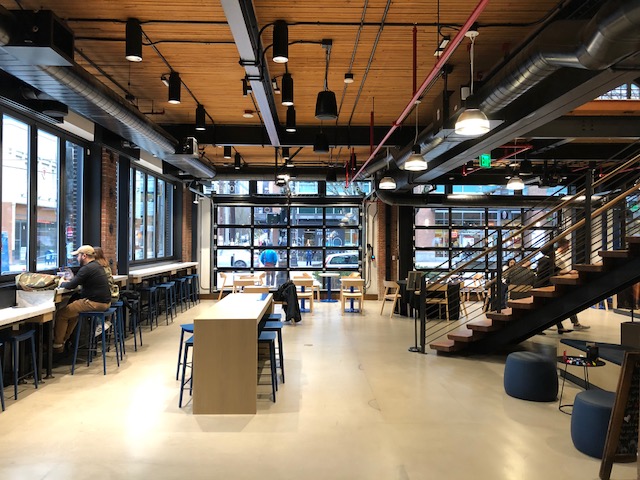
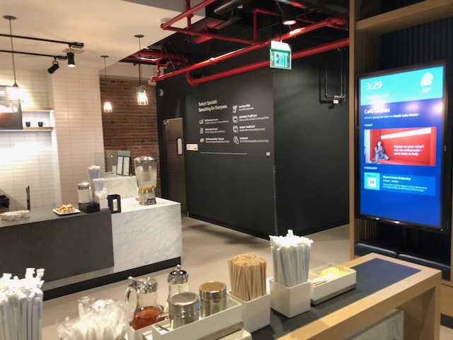
The first thing you notice about Capital One's new branch has nothing to do with banking. It's a gleaming full-scale Peet's Coffee café occupying a portion of a beautifully designed and HUGE space (formerly a high-end rug showroom). The brick facade carries into the interior of this two-storied location to combine old charm with new industrial, cozy tech.
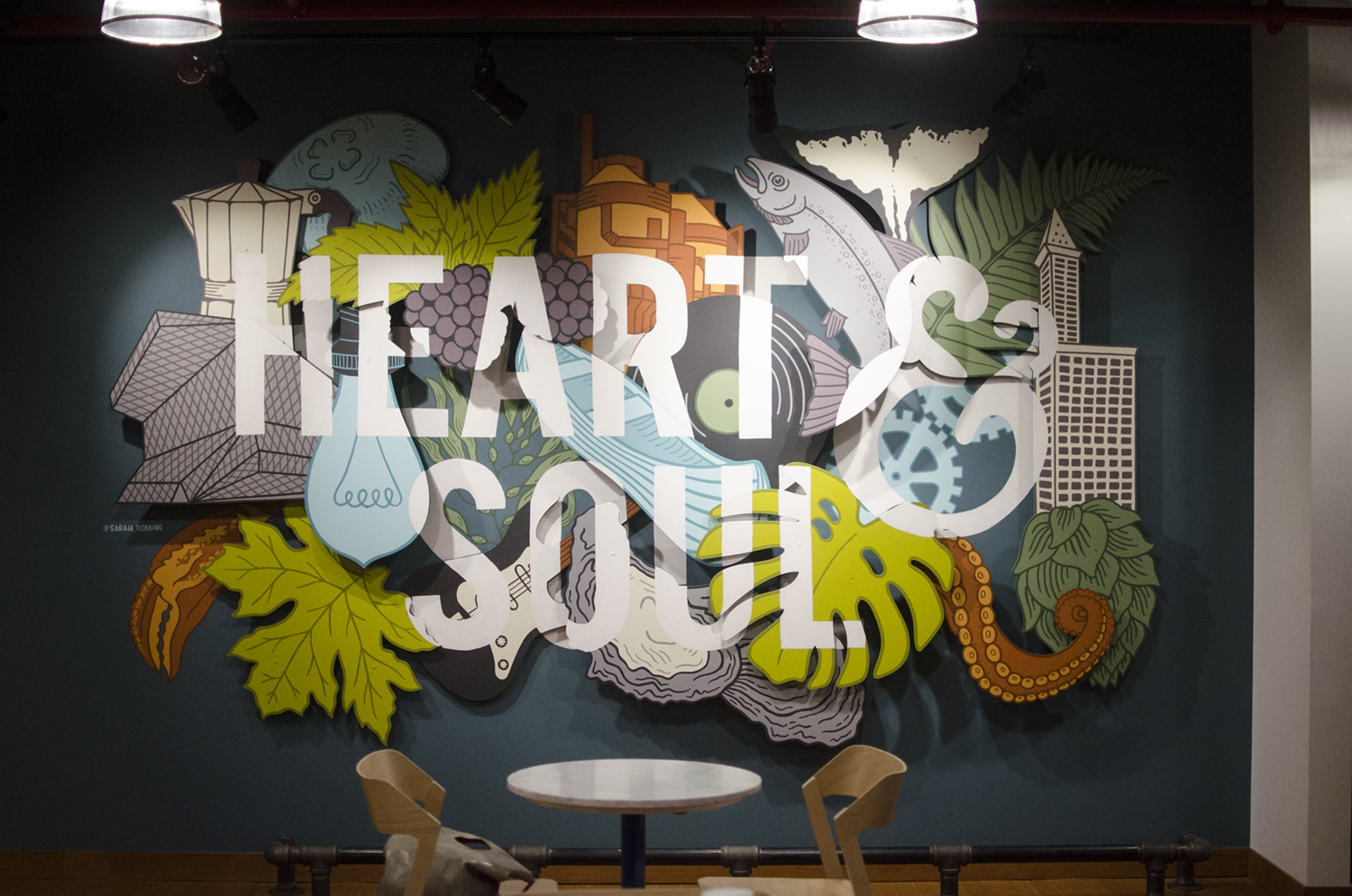
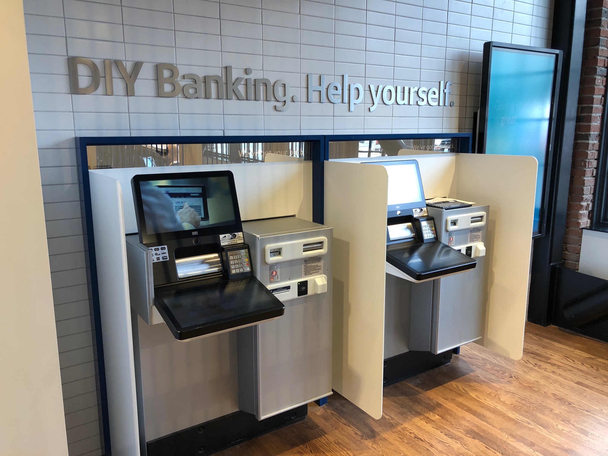
Like nutmeg on your Peet's latte, this space has merely the lightest dusting of banking, so as not to overpower the experience. Each entrance has a pair of self-serve ITM machines in vestibules, but banking is hardly the focus here. The operative insight seems to be: people don't really like banking. Or at least not bank branches. Instead, they offer a space where banking is secondary to other, much cooler things – like great architecture and interior design, good coffee, community involvement, and art.
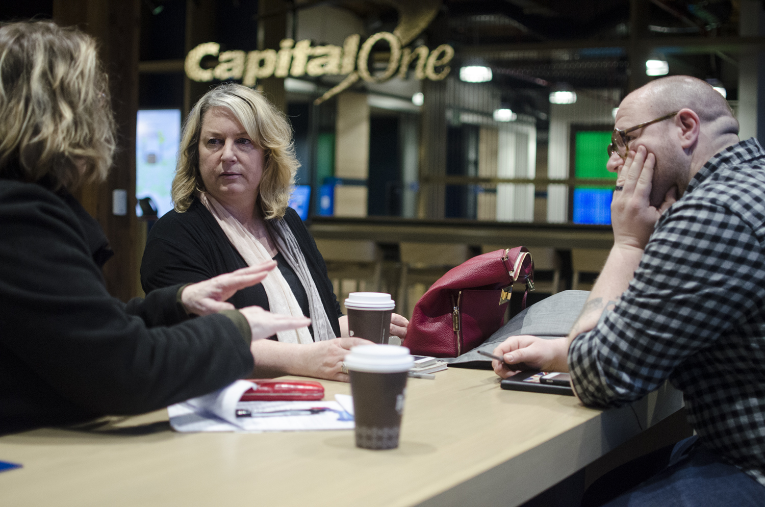
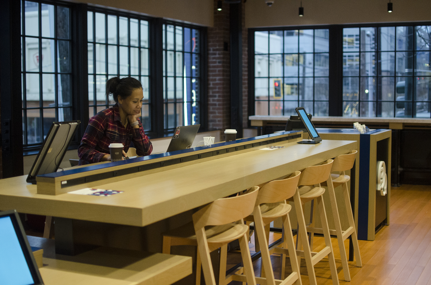
The community is encouraged to use the space to work, meet, read and relax. The space offers a variety of areas for individuals and groups, including two large conference rooms which are exclusively available for non-profit organizations to reserve. On the day we visited, a front table was dedicated to DIY Valentine’s cards – made for your own use or to contribute to Mary's Place, emergency shelter for homeless families.
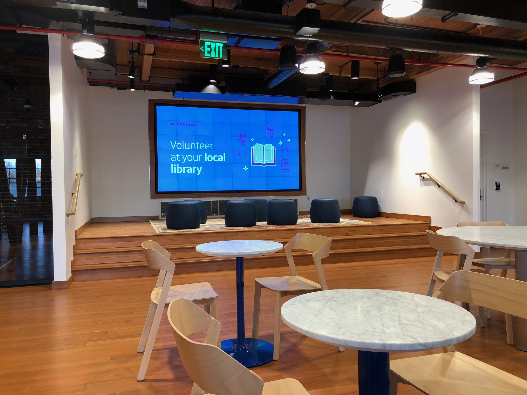
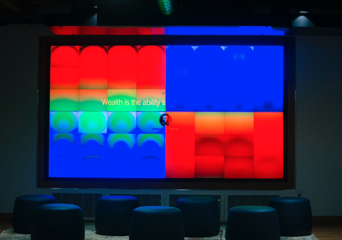
The first floor has round tables, a tech bar, and several semi-private nooks. Upstairs has an auditorium-style space with a stage and multi-screen presentation wall. Integration of technology throughout feels seamless from a distance, with a few operational bugs remaining up close. The overall design of this facility is genuinely impressive.
But is it effective for "moving the merchandise," so to speak? Do people really come here to become new Capital One customers? Do existing customers come in to sign up for additional products?
As we transitioned from the Peet's café section of the space, drinks in hand, we were greeted by a very friendly "Café Ambassador" who proudly sported a pair of red low-top Chuck Taylors. We posed our question to her: this space is stunning, but does it work?
She skillfully redirected this train of thought (their staffing and training programs are clearly dialed in). The point, she shared, is to give back to the community by offering a space and welcoming individuals and organizations into it. Our Ambassador did admit that – since Capital One is a 100% online bank – some people feel uncomfortable only interfacing with their bank online. When they come into a Capital One Café, they are guided through the process by a person – but they are still banking completely online.
And that's the second operative insight underlying this retail strategy: as branch traffic has declined, the role of branches in the banking relationship has evolved. Consumers don't want to have to come into a branch for day-to-day transactions like depositing a check, but they still want to know they CAN. And they still want the comfort of knowing that a real-life person will walk them through whatever they need.
“Seattle now has a smaller share of offices sitting empty than San Francisco or Manhattan, the two most expensive commercial real-estate markets in the country,” according to Mike Rosenberg (@ByRoseberg), Seattle Times business reporter. Seattle commercial real estate is now more expensive than Chicago and Los Angeles, and business rents have recently increased 2.5 times faster than the national average. Full article here.
In the equation of this branch strategy, Capital One is rolling the cost of a regional network into one extraordinarily expensive piece of real estate: locating it in a hot spot, building it out with an emphasis on great design, quality finishes, technology meant to impress, and partnering with a regional coffee brand to generate foot traffic.
Suddenly, the branch’s competitive set includes co-working spaces like WeWork, not just big national banks, and “Third Places” like Starbucks, not just local credit unions. If every branch is an expression of the financial institution’s brand, Capital One is fully embracing that opportunity and making a Big Statement.
After our individual self-guided tours, our little away team regrouped to discuss our impressions, and how the Café Concept aligns with our own banking expectations:
Kory, Associate Creative Director
I appreciated the way the space retained the exterior and look of the prior building, and the use of materials and style in matching nicely with the urban feel of the neighborhood and its location.
My tween and teen daughters don’t understand how much more convenient online services like remote deposit capture are versus going into a branch to deposit a check, because they never had stopping by the bank as a part of their regular errands.
Bringing what consumers are now more familiar with as a virtual service – the Capital One credit card – into a physical presence is more like when Amazon opened its brick and mortar bookstores than when Chase opens a new high-end branch. It’s about offering a physical experience, which might be rarely used but have high emotional impact.
Joshua, Account Manager
It was a juxtaposition. The space and design of the café is really cool, modern and inviting – but I also felt a twinge of confusion. The banking aspects of the space weren’t well labeled and it took a bit of exploring to figure out where I would need to go to take care of my business. I like the self-service capabilities available, but it didn’t instill confidence for conducting more sophisticated banking, such as applying for loans. For me it felt too laissez-faire to discuss a home loan. Perhaps it was the layout of the space, the younger age of the staff, or the fact that this is just a new-to-me format. Overall, that feeling of confidence, trust, and experience wasn’t there for me.
Kathy, Production Manager
The atmosphere was warm, clean, open, airy, accessible, welcoming, tuned in, and innovative. As I spent a half hour there, sipped my latte, sampled the candied blueberries, noted the “make a valentine to be donated to a homeless charity” station, and plugged in my phone charger, my main takeaway was this: I immediately wanted to tell people about it, and that they should come here. Maybe not for the banking – but hey, “come for the vibe, stay for the banking!”
We also invited a special guest to participate in our conversation: Kathy's 19-year-old son, Sam. Because of the distinct business model, the "customer of the future" should get a chance to weigh in!
Sam, Student
Compared to my current experience at a large national bank, I felt slightly less tended-to by the staff, but I didn’t find myself missing it. I don’t know if I’d consider a full switch from my current bank, given the convenience of their ATMs throughout the world. I am, however, very interested in their credit offerings and potentially opening a line of credit at Capital One. The staff answered any questions I had and I appreciated their tech-forward business model. For me and people my age it makes a lot more sense having a solid and powerful banking app and online presence than going in and talking to a banker.


Downtown Seattle, and specifically South Lake Union, is the kind of place where a brand would want to make a Big Statement, and could perhaps justify the big investment to be here and to do something really category-breaking. But what about other neighborhoods that aren’t so “hot” but still have people who crave the reassurance that a real person is nearby and able to help. In other words, communities that credit unions serve across the country, who deserve branches that are relevant to their needs today and tomorrow.
Many financial institutions wrestle with what to do with their (often aging) branch networks, given the changing usage trends and industry-wide chatter of declining importance. At Strum, we know branches are still a vital channel to today’s omni-channel consumers. The question each credit union should be asking is: how do we shape our overall experience for the way our members want to bank today and into the future, and how can the branch environment better support that goal?
If Capital One’s Café Concept offers a lesson to other financial institutions, it is at least this: there is plenty of room for branches to break out of traditional expectations, and that difference can be delightful.
In any financial institutions' reimagining the branch experience of its future, we believe that exploring and openly considering retail models much different from the norm is a vital part of the process – along with robust data analytics, multidisciplinary collaboration, and, of course, the inclusion of industry-experienced partners.
“The question financial institutions should be asking is: how do we shape our overall experience for the way our members want to bank today and into the future, and how can the branch environment better support that goal?”
So if you find yourself in Seattle’s South Lake Union neighborhood – or if you are looking for a destination to inspire and prompt fresh thinking – you shouldn’t miss spending some quality time in this Capital One Café Concept. We’ll even meet you there for a cup of Peet’s coffee, sprinkled with just a hint of banking.
Co-authored by Charlotte Boutz-Connell, Director of Client Experience at Strum.


